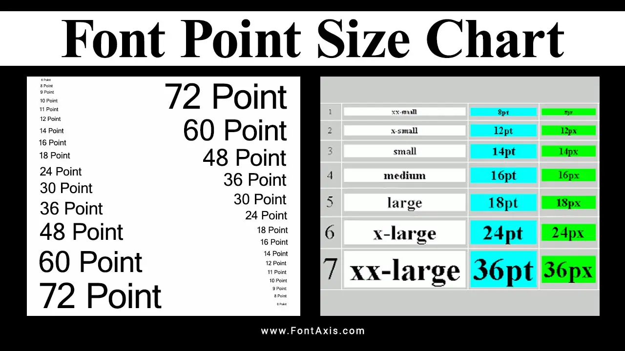
Understanding font point size is crucial for effective typography in both printed materials and web design. Here’s a simple font point size chart that provides a visual reference for common font sizes and their equivalents in pixels (px) and other measurements:

| Point Size (pt) | Pixel Size (px) | Equivalent Size (em) | Common Usage |
| 6 pt | 8 px | 0.5 em | Footnotes, small text |
| 8 pt | 10 px | 0.625 em | Captions, disclaimers |
| 10 pt | 13 px | 0.833 em | Small print, sidebars |
| 12 pt | 16 px | 1 em | Body text, standard text |
| 14 pt | 18 px | 1.125 em | Subheadings |
| 16 pt | 21 px | 1.25 em | Headings, important text |
| 18 pt | 24 px | 1.5 em | Titles, prominent text |
| 24 pt | 32 px | 2 em | Large headings |
| 36 pt | 48 px | 3 em | Main titles |
| 48 pt | 64 px | 4 em | Hero text, banners |
Notes:
- Point Size (pt): Traditionally used in print typography.
- Pixel Size (px): Commonly used for digital displays.
- em: A relative unit that scales based on the font size of the parent element.
Usage Tips:
- Choose sizes based on your audience and content. For readability, 12 pt or 16 px is standard for body text.
- Use larger sizes for headings to create a clear hierarchy in your content.
- Consider accessibility; ensure contrast between text size and background for better readability.
Optimal Point Sizes For Different Contexts

In printed materials, the optimal point size for body text typically ranges from 10 to 12 points. Most documents default to 12 point type, which has become a standard, but smaller sizes can often be more comfortable to read. 12 point has historical roots, largely stemming from typewriter traditions, but modern typesetting frequently utilizes sizes around 10 points for better readability.
For web design, the recommended body font size ranges from 15 to 25 pixels. This is due to the need for larger sizes when viewing screens from a distance. Web browsers render text differently than printed materials, so it’s essential to consider the pixel measurement for web content.
Understanding Key Typography Terms
- Cap Height: The height of the capital letters in a typeface. This measurement can affect the visual balance of your text.
- Line Spacing: Also known as line height, this is the vertical distance between lines of text. Proper line spacing enhances readability, especially with smaller fonts.
- Typeface vs. Font Face: While often used interchangeably, a typeface refers to the design of the letters (like Arial or Times New Roman), whereas a font face refers to a specific style within that typeface (like bold or italic).
- Serif Fonts: Fonts with small lines or decorative strokes at the ends of letters. These often shine in printed materials for their readability.
- Fine Print: Smaller text often used for disclaimers or additional information, which can be a challenge to read without proper sizing.
Choosing The Right Size
When selecting the right font size, consider the following:
- Main Content: Body text should generally be in the 12 point to 15 pixels range, ensuring legibility.
- Captions and Labels: These can be slightly smaller, typically 10 to 12 point, but should still be easy to read.
- Headings: Use larger sizes for headings (like 18 to 24 pixels) to create a clear hierarchy within your content.
Using Google Fonts And Free Fonts
Platforms like Google Fonts provide a variety of free fonts that are optimized for web use. When using these, ensure you maintain a minimum font size of 12 points or 15 pixels to ensure readability across devices.
Conclusion
Proper font sizing is essential for effective communication in both print and digital formats. By understanding the various measurements and how they impact typography, you can ensure your text is not only visually appealing but also easy to read.
FAQs
1.What Is The Optimal Point Size For Printed Materials?
The optimal point size for body text in print is typically 10–12 points.
2.How Does Pixel Size Differ From Point Size?
Pixel size is commonly used for web content, with 15–25 pixels recommended for body text, while point size is traditionally used in print.
3.What Is Line Spacing, And Why Is It Important?
Line spacing, or line height, is the vertical distance between lines of text. Proper line spacing enhances readability, especially with smaller fonts.
4.What Are Serif Fonts, And Where Are They Used?
Serif fonts have decorative strokes at the ends of letters and are often used in printed materials for better readability.
5.How Can I Ensure My Text Is Legible On Screens?
To enhance readability, use a minimum font size of 12 points or 15 pixels and select appropriate line spacing and font choices.
