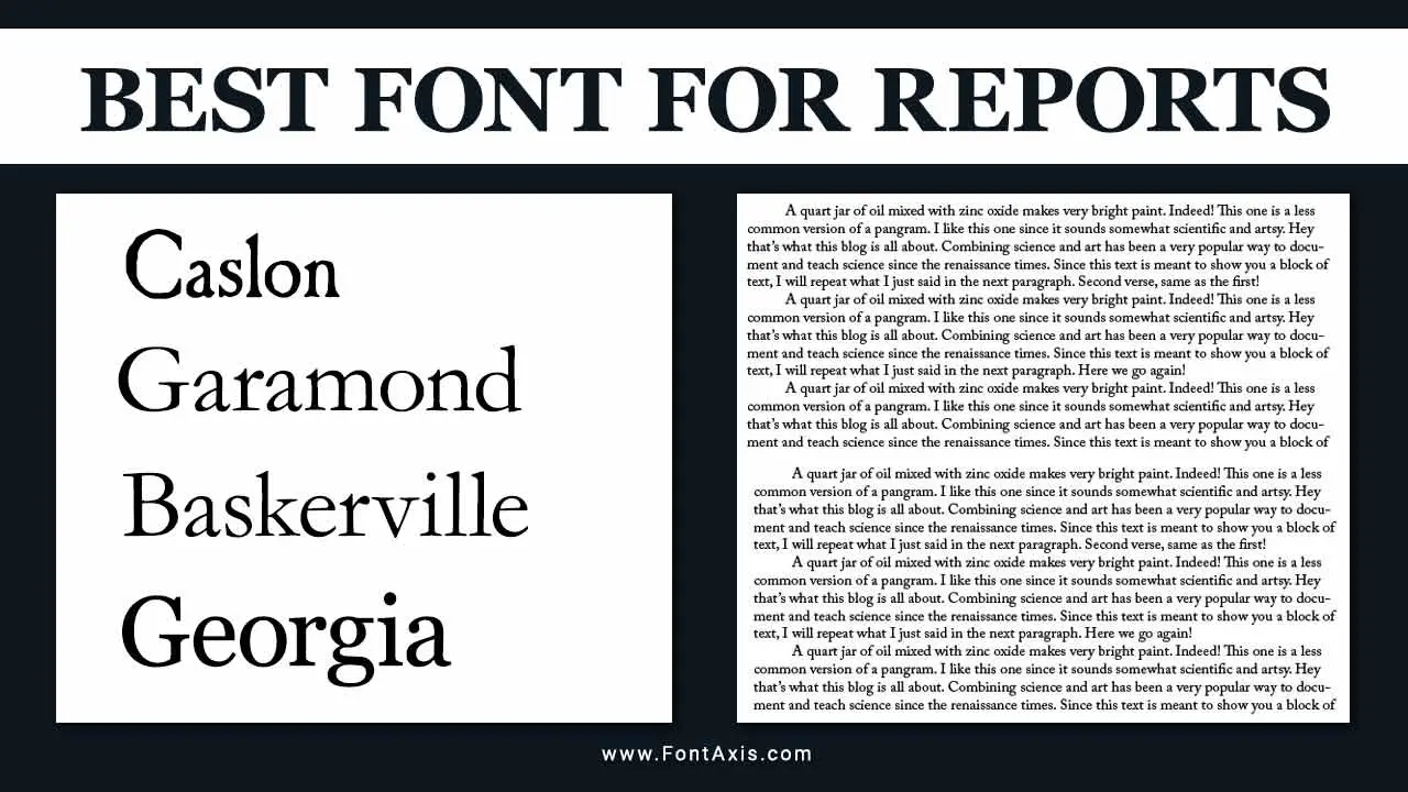
Choosing the right font in professional documentation is essential for enhancing readability and effectively conveying information.
Whether you’re working on academic papers, legal documents, or general reports, the best font for reports is crucial in how your audience perceives your work. Here, we explore the top fonts suitable for reports, highlighting their features and the contexts in which they excel.

The Best Fonts For Reports
Here’s a breakdown of some of the best fonts for various reporting needs:

1. Times New Roman
Many people widely use Times New Roman, a classic serif typeface, in academic papers and formal documents. Many word processors default to 12-point font, making it a go-to choice for legal documents and formal reports.
2. Arial
Designers and writers often choose Arial, a popular sans-serif font, for its clean lines and modern appearance. Its excellent readability makes it a preferred choice for both digital and printed materials. As a web-safe font, it ensures consistent display across different platforms.
3. Helvetica
Designers and companies revere Helvetica for its clean and professional aesthetic. They frequently utilize this sans-serif font in corporate reports and presentations due to its clarity and versatility.
4. Proxima Nova
Proxima Nova combines a modern look with a geometric style, making it an excellent choice for reports that require a contemporary touch. It’s particularly popular in web design but works well in printed materials too.
5. Trebuchet MS
Trebuchet MS is a versatile sans-serif font that is easy to read on screens and paper. It is a good option for reports that blend informal and formal elements.
6. Noto Sans
As a highly accessible font, Noto Sans supports multiple languages and character sets. This makes it a great choice for reports that require multilingual support, ensuring clarity for all readers.
7. Source Sans Pro
Adobe designed Source Sans Pro specifically for user interfaces, making it an ideal choice for digital reports. Its clear structure enhances readability, especially in body text.
8. Comic Sans MS
Although often regarded as inappropriate for formal reports, Comic Sans MS can effectively use less formal documents, such as internal communications or presentations aimed at a younger audience. However, it is generally advised to use it sparingly.
9. Segoe UI
Segoe UI is the default font in Microsoft applications and is designed for screen clarity. It is an excellent choice for reports intended for digital distribution.
10. Custom And Decorative Fonts
While decorative fonts can add flair to headings and titles, they should be used cautiously. For formal reports, sticking to standard fonts is advisable to maintain professionalism. However, custom fonts can enhance branding if the report is less formal and intended for specific audiences.
Choosing The Right Font Size And Style
The text size is equally important as the font choice. Most writers consider a 12-point font standard for body text in reports, but they may choose larger sizes for headings and subheadings. Ensuring a text size that promotes readability is crucial, especially for longer documents.
Font Choice Considerations
When selecting a font for reports, consider the following factors:
- Readability: Ensure the font is easily read at a distance or on-screen.
- Context: Match the font style with the report’s tone (formal vs. informal).
- Consistency: Stick to a limited selection of fonts to maintain a cohesive appearance throughout the document.
- Legality: For legal documents, opt for fonts known for their clarity and professionalism, such as Times New Roman or Arial.
Conclusion
Selecting the best font for reports is essential in ensuring clarity and professionalism in your documentation. Whether you opt for a classic serif font like Times New Roman or a modern sans serif font like Arial, the key is to prioritize readability and appropriateness for your audience. By understanding the different font types and their applications, you can enhance the effectiveness of your reports, making them visually appealing and easy to comprehend.
FAQs
1.What Is The Best Font For Legal Documents?
Serif fonts, such as Times New Roman or Arial, are typically the best fonts for legal documents, as they enhance readability and convey professionalism.
2.Can I Use Comic Sans In A Formal Report?
While Comic Sans can add a casual touch, it is generally not recommended for formal reports due to its informal appearance. Use it sparingly in less formal contexts.
3.What Size Should The Font Be For A Report?
A standard font size for body text in reports is usually 12 points, but headings may vary from 14 to 18 points for emphasis.
4.Are There Any Fonts That Work Well For Digital Reports?
Yes, fonts like Arial, Helvetica, and Noto Sans are excellent choices for digital reports because they are clear on screens.
5.What Are Decorative Fonts, And Should I Use Them In Reports?
Decorative fonts are styled fonts that can add flair to a document. However, they should be used cautiously in reports, as they may detract from professionalism. Stick to standard fonts for the body text.
