Understanding the difference between font size and text size is essential for anyone involved in design, whether it’s for web, print, or document creation.
While they may sound similar, these terms have distinct meanings in typography, influencing readability, visual hierarchy, and overall layout design. Below is a detailed exploration of how font size and text size differ, as well as how they impact typography, web design, and readability.

Explained Difference Between Font Size And The Text Size

What Is Font Size?
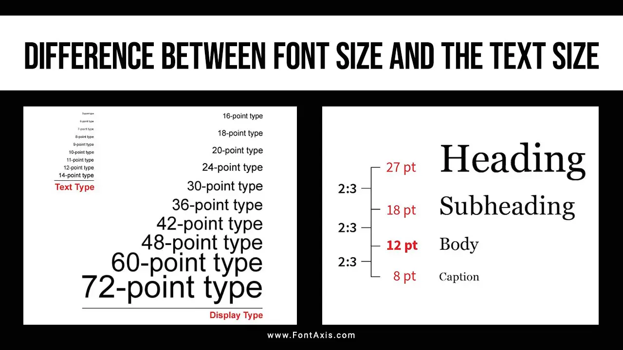
Font size refers to the height of characters within a typeface, generally measured in points (pt) or pixels (px). Each point size defines the vertical measurement of the characters, which is known as point size. This standard measure is used across various platforms, including Microsoft Word and web design software.
- Point Size: Each point represents 1/72 of an inch. For instance, 12-point font size means each character is 1/6 inch tall.
- Cap Height: The cap height is the height of capital letters in a font and often represents the visible portion of a font’s height.
- Absolute Font Size: Font size is an absolute size measurement, meaning a 12-point font size will look the same in most documents, regardless of the software used.
Font size affects readability and hierarchy, as a larger font size makes text more prominent, while smaller fonts are generally used for secondary information.
What Is Text Size?
Text size refers to the actual visual appearance of the text on a screen or printed page. It’s influenced not only by the font size but also by other attributes such as line height, font weight, and font style. In web design, for instance, text size is often displayed differently across various screen sizes due to responsive scaling.
- Relative Sizes: Text size varies based on the environment, as different screens and browsers can scale text differently.
- Line Height: The space above and below each line of text impacts readability and is particularly important for body text. This spacing is typically defined by line height in CSS for web design.
- Screen Scaling: Text size may appear smaller or larger on screens with high-resolution displays, impacting smaller screens more noticeably.
Key Differences Between Font Size And Text Size
1. Measurement
- Font Size: A fixed measurement, usually in points or pixels.
- Text Size: A relative measurement affected by scaling and screen size.
2. Display Consistency
- Font Size: Remains consistent regardless of device.
- Text Size: Adjusts based on device resolution and screen size, meaning it can appear smaller or larger depending on the medium.
3. Visual Appearance
- Font Size: Focuses on the actual size of the characters.
- Text Size: Includes additional factors like line height, font weight, and overall typography settings.
Font Size vs. Text Size In Typography
In typography, font size and text size both impact how a viewer perceives a design. Font size is essential for defining the overall type size of the characters, while text size considers readability across different devices.
- Body Font Size: Often set between 10 and 14 points for readability in body text.
- Scaling in Web Design: Modern web design uses scaling to adjust text size on screens of varying dimensions.
- Relative Sizes in Design: Designers use relative sizes like “em” or “rem” units in CSS to ensure text scales proportionately across different screen sizes.
Choosing The Right Font Size For Readability
Font size plays a significant role in readability. For instance, choosing a font size too small can make it difficult for readers to interpret the text, especially on smaller screens.
- Default Font Size: Many designers start with a base font size of 16 pixels or 12 points for body text, adjusting up or down based on the design needs.
- Different Font Sizes for Hierarchy: Use varying font sizes to create a visual hierarchy, with larger sizes for headings and smaller sizes for body text.
- Minimum Font Size: Smaller text should generally not go below 10 points for readability, especially in lengthy paragraphs.
Factors Affecting Text Size Perception
Text size can be influenced by various other typography attributes. These include font weight, font family, and line height, each contributing to how large or small the text appears.
- Font Weight: Heavier fonts, such as bold, can appear larger even if the font size remains the same.
- Font Family: Sans-serif fonts like Arial appear larger than serif fonts like Times New Roman at the same point size due to design differences.
- Line Length: Shorter line lengths with ample spacing between lines can make text appear larger and more readable.
Conclusion
Understanding the difference between font size and text size is essential for creating visually engaging and readable content. Font size is a fixed measurement defining the height of characters, while text size is the perceived size influenced by additional styling attributes. For effective typography, designers should consider both font size and text size to optimize readability and user experience across different devices.
FAQs
1.What Is The Main Difference Between Font Size And Text Size?
Font size is the fixed height of the characters, while text size refers to the actual appearance of the text on various screens, influenced by additional styling factors.
2.Why Does Text Size Look Different On Various Screens?
Text size varies due to screen resolution, scaling, and relative measurement units (like em or rem) that adjust according to the screen size.
3.What Font Size Is Best For Body Text?
For body text, a font size between 10 and 14 points is generally recommended, as it offers readability without overwhelming the reader.
4.Does Font Weight Affect Text Size Appearance?
Yes, a heavier font weight (bold) can make text appear larger even if the font size remains the same.
5.How Can I Ensure Text Is Readable On Smaller Screens?
Use a base font size with scalable units (like em or rem) and set adequate line height to ensure readability across devices, especially on mobile screens.
