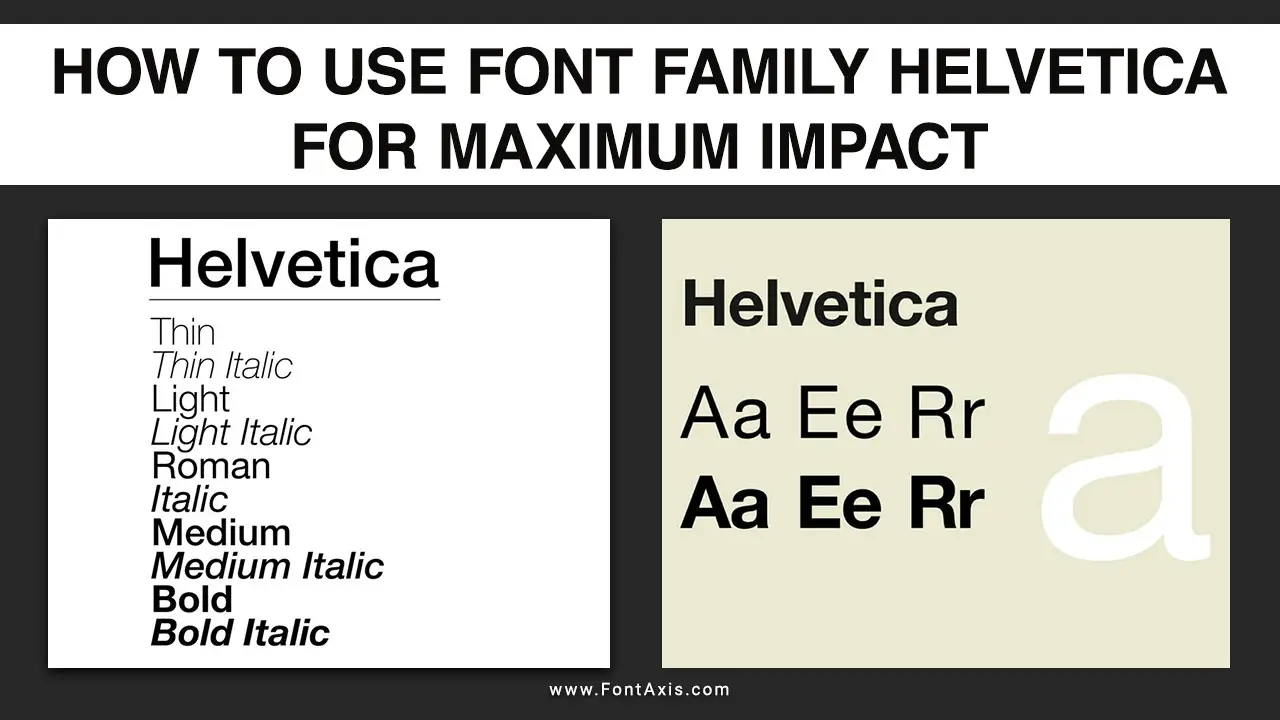
The choice of typeface can significantly influence the visual impact of your designs. Among the most iconic and versatile typefaces is the Helvetica font, created by Max Miedinger in 1957.
With its clean lines and modern aesthetic, Helvetica, especially its variant Helvetica Neue, is favored by designers in various media, from print to digital. This article explores how to effectively use the Helvetica family to achieve maximum impact in your projects.

How To Use Font Family Helvetica For Maximum Impact – Follow This Guide

Using the Helvetica Neue typeface effectively can significantly enhance your web design projects. As a sans-serif font created by Max Miedinger, Helvetica is renowned for its clean lines and modern aesthetic, making it one of the best fonts available. Here’s how to maximize the impact of the Helvetica font family:
1. Choosing the Right Font
Font Style: Utilize Helvetica Neue Light for body text to ensure readability. For headings, consider using Helvetica in a bolder weight, creating a clear visual hierarchy.
Font Combination: Pair Helvetica with a serif font like Times New Roman or Century Gothic for contrast. This font stack can create a pleasing balance between modern and classic aesthetics.
2. Using Web Safe Fonts
Web Fonts: Helvetica is available as an Adobe font and a Google font, ensuring its accessibility in various design projects. Incorporate it into your CSS for consistency across browsers.
System Fonts: Consider using system fonts like Segoe UI or Lucida Grande as fallback fonts in case Helvetica is unavailable, ensuring that your text remains legible.
3. Effective Typography
Font Size and Style: Adjust the font size appropriately for different elements. Use larger sizes for headings and smaller sizes for body text to maintain a clear hierarchy.
Variable Fonts: Explore the use of variable fonts that allow you to adjust weight and style without needing multiple font files, simplifying your design process.
4. Email Fonts
When using email fonts, ensure that they are web safe and legible across devices. While Helvetica works well for professional emails, consider Arial font or Arial Black as alternatives for compatibility.
5. Design Considerations
- Geometric Shapes: Leverage geometric shapes in your design to complement the modern feel of the Helvetica typeface. This combination can enhance visual interest and maintain a clean look.
- Font Style and Family: Explore the broader font family of Helvetica, including styles like Franklin Gothic or Akzidenz Grotesk, for a cohesive design approach that allows for flexibility.
6. Testing For Impact
- Fallback Fonts: Implement a fallback font in your CSS to ensure that if Helvetica fails to load, your text remains legible and aesthetically pleasing.
- Different Fonts: Test different fonts in your designs to see how Helvetica compares to others, such as Trebuchet MS or fantasy fonts, to determine the right font for your specific project.
Conclusion
By strategically utilizing the Helvetica Neue typeface alongside various custom fonts, web-safe fonts, and effective font combinations, you can create visually striking designs that resonate with your audience. Remember to consider the context of your design, ensuring you select the right font for maximum impact.
FAQs
1.What Is The Difference Between Helvetica And Helvetica Neue?
Helvetica Neue is a redesigned version of Helvetica, featuring a more extensive range of weights and improved clarity.
2.Can I Use Helvetica For Web Design?
Yes, Helvetica is a popular choice for web design, but ensure to use a font stack for compatibility across browsers.
3.What Are Some Good Font Combinations With Helvetica?
Pairing Helvetica with serif fonts like Georgia or decorative fonts like Playfair Display can create a nice contrast.
4.Is Helvetica A Web-Safe Font?
While Helvetica is widely used, it is not universally installed on all systems. Always include fallback fonts in your font stack.
5.How Can I Customize Helvetica?
You can use tools like Adobe Font to modify Helvetica or create new styles based on its structure.
