Fonts with lines on top and bottom are often referred to as serif fonts. These fonts have small strokes or extensions at the ends of their letters, which are the defining characteristics of a serif. Popular examples of serif fonts include Times New Roman, Garamond, and Century Gothic. These fonts are widely used in both print and digital formats due to their classic and readable design.
In contrast, sans serif fonts lack these lines, giving them a cleaner and more modern appearance. While serif fonts are commonly associated with formal or traditional settings, sans serif fonts are often preferred for digital content due to their clarity on screens.

Serif Fonts And Their Characteristics
Serif fonts are used in various formats, from books to web design, thanks to their text readability and professional look. Some common types include TrueType fonts and Adobe fonts, both of which are known for their high-quality font rendering and compatibility across different platforms.
When designing with serif fonts, it’s essential to pay attention to line spacing (also known as leading), which determines the vertical space between lines of text. Good line spacing helps maintain readability, especially in body text.
Popular Fonts With Lines On Top And Bottom
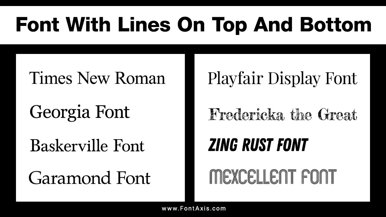
Fonts with lines on top and bottom, or serif fonts, feature decorative strokes that enhance their readability and aesthetic appeal. Here are some popular fonts showcasing these characteristics, each described in detail.

1. Times New Roman
Times New Roman is a classic serif font renowned for its traditional elegance and legibility. The capital “T” features a prominent top serif, while the lowercase “n” showcases serifs at both ends. This font is widely used in print and digital media, making it a go-to choice for formal documents, academic papers, and newspapers.
2. Georgia
Georgia was specifically designed for clarity on screens, making it an excellent choice for digital content. The capital “G” has a distinct upper serif that enhances readability, and the lowercase “e” features well-defined serifs that guide the reader’s eye. Its thick, bold serifs create a friendly and approachable feel, ideal for websites and online articles.
3. Baskerville
Baskerville is known for its sophisticated style and strong contrast between thick and thin strokes. The capital “B” showcases bold, elegant serifs that add character, while the lowercase “a” features a delicate top serif. Often used in formal publications and literary works, Baskerville exudes timeless elegance, making it perfect for printed books and classic branding.
4. Garamond
Garamond is a beloved serif typeface with a rich history, prized for its readability and beauty. The capital “G” features a stylish serif at the top and a graceful curve, while the lowercase “r” has a subtle, elegant serif. This font is frequently used in book publishing, giving texts a classic and sophisticated appearance that draws readers in.
5. Playfair Display
Playfair Display is a modern serif font that blends traditional elements with contemporary design. The capital “P” features a dramatic top serif, creating a striking visual impact, while the lowercase “f” has an elongated serif that adds flair. This font is ideal for headings and branding, providing an elegant touch that stands out in both print and digital formats.
6. Fredericka The Great
Fredericka the Great is a whimsical serif font that combines classic elements with a playful twist. The capital “F” has an exaggerated top serif, while the lowercase “t” features a quirky design with pronounced serifs. Perfect for creative projects, this font adds personality and charm to invitations, posters, and branding materials.
7. Zing Rust
Zing Rust is known for its distinctive distressed look, making it a popular choice for vintage and playful designs. The capital “Z” showcases jagged serifs that give it a rustic feel, while the lowercase “g” features a unique descender with a decorative serif. This font is perfect for projects that aim to evoke a nostalgic or retro aesthetic.
8. Mexcellent
Mexcellent is a fun and creative font that incorporates stripes and playful elements. The capital “M” features bold top serifs that enhance its structure, while the lowercase “x” has subtle serifs at the ends. This font is ideal for informal designs, making it suitable for invitations, posters, and branding aimed at a youthful audience.
Google Fonts And Serif Fonts
If you’re looking for free and accessible fonts, Google Fonts offers a variety of serif typefaces. From Times New Roman alternatives to modern serif designs, you can choose the right font family that suits your design project.
Font Metrics And Vertical Alignment
Font metrics refer to the measurements used to describe font properties like line height, letter spacing, and the positioning of glyphs (the individual shapes of characters). These measurements ensure proper alignment and consistent text flow.
In serif fonts, the descender line is the imaginary line that letters like “g” or “y” fall below, while the uppercase letters align with the top. Adjusting vertical alignment and the line gap between text can significantly impact readability, especially when mixing different fonts.
Choosing The Right Font
When selecting a font for your project, consider its intended use. Serif fonts work well for long-form content such as books or articles due to their legibility. For digital formats, you may want to pair serif fonts with sans serif fonts for a balanced design. If you’re designing for a specific language, you can also explore CJK fonts (Chinese, Japanese, and Korean), which offer the right typographic support.
Conclusion
These fonts with lines on top and bottom exemplify the beauty and functionality of serif typefaces. Choosing the right font, especially a serif font, can enhance your design’s readability and aesthetic.
Whether you’re using Google Fonts, Adobe Fonts, or custom fonts, pay attention to font metrics, line spacing, and vertical alignment for the best user experience. Serif fonts offer a timeless appeal, while modern sans serif fonts provide a fresh, clean look. Mix and match to find the right balance for your project!
FAQs
1.What Are Serif Fonts?
Serif fonts are fonts with small lines or strokes attached to the ends of the letters, adding a classic and formal look.
2.How Do Serif Fonts Differ From Sans Serif Fonts?
Sans serif fonts lack the decorative strokes found in serif fonts, giving them a cleaner and more modern appearance.
3.What Is The Best Serif Font On Google Fonts?
Some popular serif fonts on Google Fonts include Merriweather, Roboto Slab, and Playfair Display.
4.What Is Font Metric In Typography?
Font metrics refer to the measurements that define a font’s design, including height, width, line spacing, and vertical alignment.
5.What Is The Role Of Line Spacing In Text Readability?
Line spacing, or leading, is the vertical distance between lines of text. Proper spacing improves readability, especially in large blocks of text.
6.What Are Descenders In Fonts?
Descenders are the parts of letters like “g” and “y” that extend below the baseline in a font.
7.What Is The Difference Between Font Face And Font Family?
A font face refers to a specific style or weight within a font family, such as bold or italic versions of the same font.
8.What Is A Serif Typeface?
A serif typeface is a font style where small lines or strokes, called “serifs,” extend from the ends of the letters. Examples include Times New Roman and Century Gothic. It contrasts with sans serif fonts, which lack these extra strokes.
9.How Does Line Height Affect Font Readability?
Line height, the vertical space between lines of text, helps improve readability by ensuring text doesn’t feel crowded. Adjusting line height is essential in typography to create visually balanced text in tools like Google Fonts or Adobe Fonts.
10.What Is The Purpose Of Letter Spacing?
Letter spacing (also called “tracking”) adjusts the space between characters in a font. Increasing or decreasing the space helps with readability, especially in lowercase letters, and affects how fonts like Tahoma or Script Fonts appear in design.
11.What Are Glyphs In A Font?
Glyphs are the individual characters and symbols in a font. Each glyph represents a letter, number, or punctuation mark. For example, uppercase and lowercase letters, as well as specific elements like descenders and the tallest glyph, are all considered glyphs.
12.What Are CJK Fonts?
CJK fonts are fonts that support Chinese, Japanese, and Korean characters, often designed to work alongside other fonts in multilingual projects.
