Typography is a vital aspect of communication, ensuring that text is both legible and aesthetically pleasing. Among the numerous font sizes available, 12-point font has stood the test of time as the standard for professional and academic documents. Whether in Times New Roman or another serif font, this size is universally popular for its balance of readability and practicality.
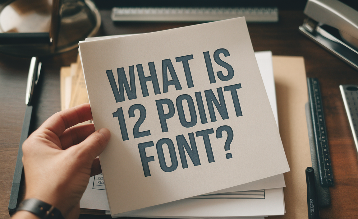
So, What is 12 Point Font, Actually?
The term “12 point font” refers to the point size used to measure the height of characters in a particular font. A point is a unit of measurement in typography, with 1 point equaling approximately 1/72 of an inch. Thus, a 12-point typeface measures about 1/6 of an inch from the top of a capital letter to the bottom of a descender, making it an ideal size for both digital and print media.
- Point Size: Measures the vertical height of text.
- Font Size: Includes the height and spacing of text characters.
- 12 pt Font: Often used as the default size in word processors like Microsoft Word.
Why is 12 Point Font Standard?
- Readability:
With a moderate height, 12-point font strikes a balance between smaller sizes like 10-point, which may strain the eyes, and larger sizes, which can disrupt formatting. - Professional Norms:
Most academic and professional guidelines, including those for reports, essays, and resumes, specify a 12-point type, often in Times New Roman or a similar serif font, to maintain uniformity. - Adaptability Across Formats:
Whether for digital screens or printed pages, 12-point font ensures consistent legibility. For instance, the same text in Times Roman or a digital type like Arial at 12-point retains clarity regardless of the medium. - Compatibility with Layout Standards:
A 12-point type aligns seamlessly with standard document settings, such as 1-inch margins and double-spacing, optimizing readability and word count per page.
12 Point Font Across Fonts
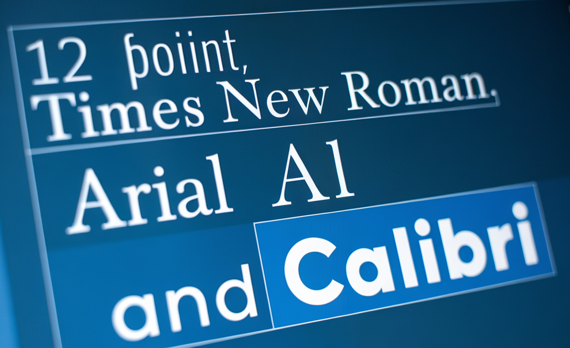
Different fonts appear slightly varied at the same size due to differences in their design. For instance:
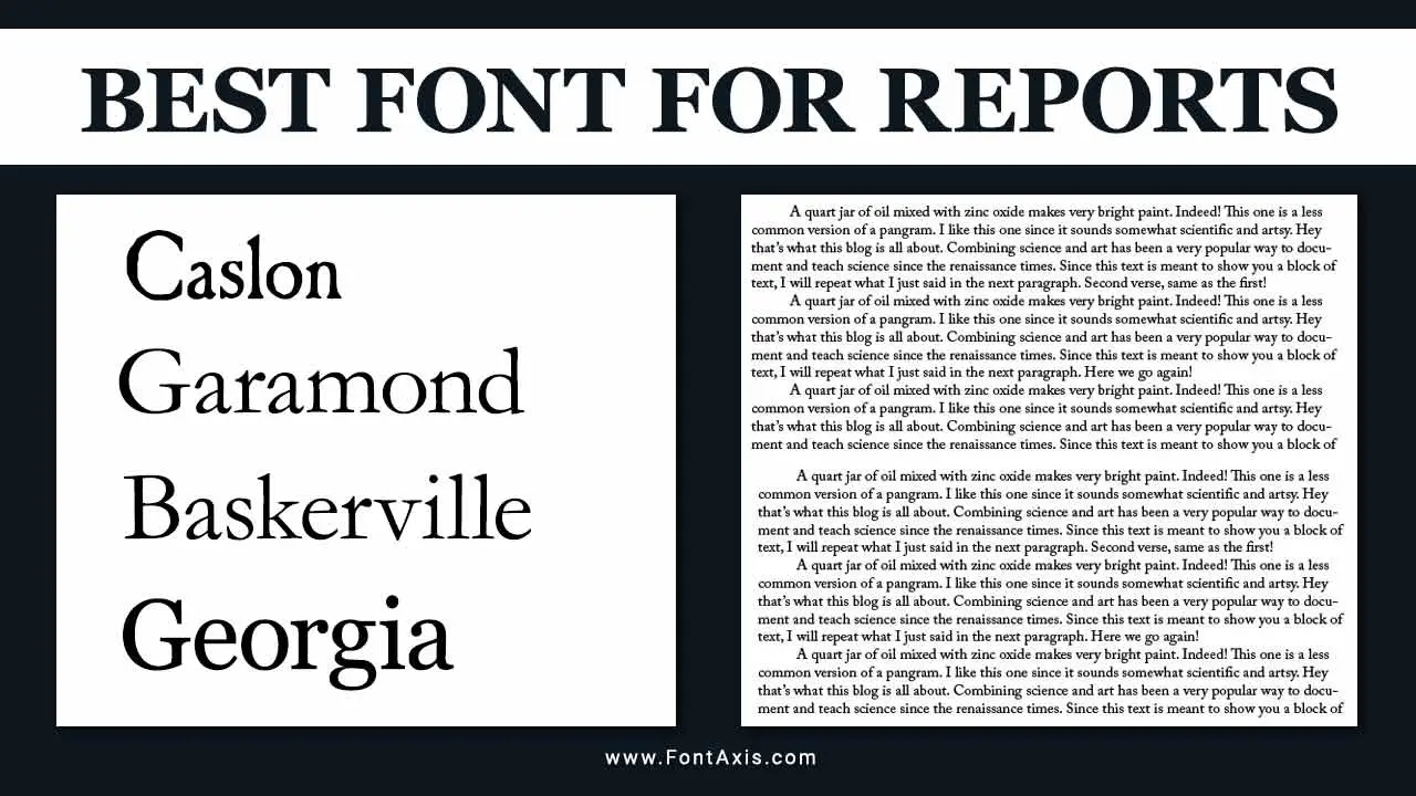
- Times New Roman: A serif font with elegant proportions, often used in formal documents.
- Arial: A sans-serif alternative that provides a modern look.
- Calibri: The default font in Microsoft Word, offering enhanced functionality in digital formats.
When working with 12-point type, choosing the right typeface is crucial for setting the tone of the document. Serif fonts like Times Roman are ideal for traditional purposes, while sans-serif fonts like Helvetica work well in more casual settings.
Measuring 12 Point Font
In traditional typography, point size was linked to metal type, where the height of the typeface determined its physical size. Today, in digital typography, the point size reflects relative size on a screen or printed page. For example:
- 12 pt Font to Pixels: Approximately 16 pixels on most screens.
- 12 pt Font to Millimeters: Roughly 4.23 mm.
- 6 Picas: Equivalent to a 12-point font, as 1 pica equals 12 points.
This standardization simplifies aligning text and maintaining proportions across different media.
Why 12 Point Font is Preferred
- Word Count Management:
Professional and academic settings often require a specific word count per page. A 12-point size ensures consistent word density, making it easier to meet these requirements. - Clear Hierarchy:
Larger sizes like 14-point are handy for headings, while smaller sizes like 10-point are reserved for footnotes or signatures. A 12-point font maintains harmony between text elements. - Typography Standards:
Typographical guidelines emphasize 12-point as the default size for body text in documents like research papers and official correspondence.
Adjusting 12 Point Font
While 12-point font is a standard, there are situations where smaller sizes or different fonts are necessary:
- Footnotes: Typically set at 10-point to conserve space while maintaining legibility.
- Margins: Adjusting the left margin or line height can balance text layout for better visual appeal.
- Digital Formats: For screens, a slightly larger point size, like 14-point, may be used for improved readability.
Conversions and Metrics
- In Pixels: 12-point font roughly translates to 16 pixels on screens, though this varies depending on the resolution.
- In Inches: As 12-point is 1/6th of an inch, six lines of text in 12-point font will fit in a 1-inch vertical space.
- Millimeters: The size is approximately 4.23 mm.
The Role of Margins and Line Spacing
- Left Margin: Adequate margins ensure a balanced layout when using 12-point font.
- Line Spacing: Typically, line height is set to 1.5x or 2x the font size for readability in lengthy texts.
Enhanced Functionality of 12 Point Font
- Footnotes and Annotations: Perfect for clear, concise annotations in academic or professional documents.
- Different Sizes: Pairing 12-point font with smaller or larger sizes creates visual hierarchy.
Comparisons with Other Sizes
While 12-point font is the norm, other sizes serve specific purposes:
- Smaller Sizes (10 pt): Used in disclaimers or compact documents.
- Larger Sizes (14 pt): Common in titles or for readers with visual impairments.
- Relative Size Adjustments: A word processor allows flexible resizing to fit design needs without sacrificing clarity.
Best Practices for Using 12 Point Font
- Pairing Fonts: Use complementary fonts for headings and body text. For instance, pair Times New Roman for body text with Arial for headings.
- Consistency: Ensure all text elements, including footnotes and captions, align with the chosen font size for a polished look.
- Readability: Maintain adequate contrast and spacing to enhance legibility, especially in digital formats.
Conclusion
The 12-point font remains the gold standard for documents due to its readability, professional appeal, and versatility. Its widespread use across word processors, including Microsoft Word, ensures consistent formatting and accessibility. Whether in Times New Roman or another serif font, the 12-point type embodies the balance of form and function in typography.
FAQs
What is 12 point font size in pixels?
Approximately 16 pixels on most digital screens.
Why is 12 point font size commonly used?
It balances readability, professionalism, and adaptability for print and digital formats.
What fonts work best at 12 point size?
Times New Roman, Arial, and Calibri are excellent choices, each offering clarity and versatility.
How does 12 point font compare to 10 point?
12-point font is easier to read, especially in long documents, while 10-point is suited for compact layouts like footnotes.